
The Kitchen Walls Mini-Series - 3 -
So, you know how you read blogs and when they do the reveal post it looks like their house is straight out of a magazine? This is not happening here...
Vous savez combien les photos de blog semblent sorties tout droit d'un magazine? Ce n'est pas ce qui se passe ici...

I'm only including the not too shabby picture first, as I noticed my first picture is usually the one that appears on your sidebar if you have my blog there (and thank you very much by the way).
Je vous mets juste la photo la moins pire au début pour ne pas vous affoler. Certes, cet article est un avant/après pour les murs, mais le reste de la cuisine est toujours de bric et de broc! Mais rénover une vieille maison, c'est aussi ça!
So, about that reveal, the walls are painted, but the kitchen is not done yet, obviously. I thought that I'd post pictures anyway... It's not blogworthy per se, but maybe some people will be relieved to see what living in a house going under renovation really is.

A little reminder of what the kitchen looked like when the previous owner lived there. Not that I don't like yellow, but this one was a little aggressive according to me and I wanted a serene kitchen.
Pour ceux qui auraient oublié, je vous remets ce à quoi ressemblait la cuisine quand j'ai acheté. Je n'ai rien contre le jaune, mais j'imaginais pour moi une cuisine plus sereine.
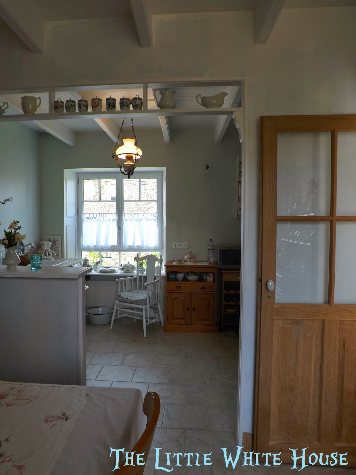
The same room today, from a slightly different angle, because I moved the door so I can't really take it from the same spot anymore!
La même cuisine, aujourd'hui, prise presque du même angle... En fait, j'ai déplacé la porte lors de travaux, alors je ne peux plus prendre du même angle!
 |
| Yes, this a light bulb... I told you it wasn't finished! |
You can read how I hesitated between three shades of seaglass for the walls here.

The winner was the lightest shade, called Pavilion Blue by Farrow & Ball.
Après avoir hésité sur plusieurs teintes de peinture car je cherchais quelque chose qui rappelle le verre poli par la mer, je me suis décidée pour "Pavilion Blue" de Farrow & Ball.

It's a lovely shade (well, I think so at least) that varies slightly from green to blue. It's greener with the lights on in the evening (like above) and bluer in the morning light (as below). Obviously uggly pictures of on-going work, but I thought they "explained" the colour well...
C'est une teinte superbe qui, grâce à ses pigments naturels, varie légèrement du bleu au vert. Elle apparaît plus verte le soir avec les lampes allumées (ci-dessus) et plus bleu dans la lumière du petit matin (ci-dessous). Ce sont d'horribles photos prises pendant les travaux, mais je pense qu'elles "expliquent" bien cette peinture.

You can see how light it is on a bright day, on the wall next to the window.

Vous pouvez aussi voir combien la teinte paraît claire un jour ensoleillé sur le mur situé près de la fenêtre.

And yes, all the cooking is done here! The next picture isn't straight, but because you can see a white beam, I think it shows the colour nicely. I painted the shelf white to see how white cabinets would look on my walls.

Eh oui, toute la cuisine de la maison se fait sur cette petite table pour l'instant. La photo est un peu de travers, mais apercevoir la poutre blanche permet de mieux saisir le contraste du mur...
I really, really like the colour. Still painting wasn't a piece of cake, so I thought I'd tell you a little about it, so you don't panic if you choose the same kind of paint.
J'aime beaucoup la couleur, mais peindre n'a pas été qu'une partie de plaisir... Pour le cas où certains voudraient utiliser une teinte similaire, je vais vous raconter mes angoisses.

As you can see, we used in the kitchen a special kind of drywall that is OK with humidity... Unfortunately, it's very green... So I used two coats of primer to be sure my light shade of seaglass wouldn't get unwanted shadows from the colour of the drywall.
Comme la cuisine était humide, du placo anti-humidité a été mis sur les murs. Il est d'un vert assez foncé. J'ai eu peur qu'il crée des ombres sur ma teinte "verre poli par la mer" et je lui ai donc pour commencer appliqué deux couches de sous-couche. C'est pénible, mais je le conseille vraiment.

The paint, when you get it out of the can, looks rather white. It makes painting very, very difficult because you can't really see where you put paint and where you didn't. Believe me, I would have sworn I had done a perfect job, but when the first coat dried and the colour began to reveal itself, there were "holes" in it.
Quand elle sort de son pot, la peinture ressemble à s'y méprendre à du blanc (j'ai même cru que je m'étais trompée dans ma commande). Cela rend les choses très difficiles. En passant la première couche sur la sous-couche blanche, on ne voit pas ce qu'on fait. J'ai vraiment eu l'impression de passer partout à la perfection et quand la peinture a séché et pris sa couleur, il y avait des "trous" à plusieurs endroits.
You can see how light it is when it isn't dry in the picture under the window and it darkens as it dries as you can see below. It makes making clean lines very difficult...

Now, after that first coat, I was on the verge of tears, thinking I should have asked a painter to do it... But the next day, I braced myself, did the second coat and it was perfect! So don't be discourage by a first coat that isn't all you wanted it to be!
J'étais sérieusement découragée, pensant que j'aurais dû faire appel à un professionnel, mais le lendemain, deuxième couche très soigneuse (plus facile aussi puisqu'on applique une peinture qui a l'air blanche sur un mur devenu coloré) et là, superbe!

I took this picture because I was hoping the tray which has both true blue and green in it would help you define the colour of the wall... Katja, I hope it'll be useful for you.
So what do you think? Feel free to share your Farrow & Ball tips in the comments!
Alors qu'en pensez-vous? Avez-vous des astuces peinture à partager dans les commentaires?

See you soon,
A bientôt,

PS1: Headaches are improving. I'll share what natural things I used if it keeps improving just in case it can help someone else.
PS2: Who noticed a "new" lamp in my kitchen? I'll tell you all about it later this month.
PS3: I need to bake a lemon pie in that serene kitchen of mine for my parents who are visiting tomorrow.
PS4: I'm partying with some great bloggers you could steal inspiration from!


Very brave to do the painting yourself, but it looks super, just as I imagined it would.
ReplyDeleteDear Magali,
ReplyDeletehappy Easter to you! I love the colour of your wall and I prefer your pictures to any fancy magazine! It is most encouraging and inspiring to watch your home grow and become more lovely from week to week. Real life is better than the big show, I think. Of course I like to read about colours on walls and furniture, because this will be useful in a few weeks....
Also, I am so glad to hear, that your headache is improving! Baking in your kitchen must be fun, as it is such a lovely place already...
Yours Sarah
It is just beautiful, Magali! I know how difficult it is to paint a light color over a light color. Almost impossible to see where you've painted. I love the open shelves in the kitchen. I'd love to do that, but I'm afraid I'd have to have to do a major cleaning out first. The color blue/green is lovely, how it seems to shift with the amount of light.
ReplyDeleteHave a wonderful Easter Day as we celebrate our Risen Savior!
Vraiment j'admire ton courage ! Et le résultat est vraiment bien... en tout cas aussi bien sinon mieux que si c'était fait par un professionnel. Alors, à tout hasard, je te signale que ma chambre jaune voudrait passer au blanc/crème... Elle me l'a soufflé un soir à l'oreille.
ReplyDeleteThe color turned out beautiful. I love the contrast between the sea glass and the white. You are on your way to a wonderful reveal!
ReplyDeleteI like the color very much and I believe you made a wonderful choice. Your kitchen looks so warm and comfortable - love the chair by the window where you can set, have a cup of tea and look out the window. Can hardly wait to see the final reveal.
ReplyDeleteHave a terrific time with your family - lemon pie sounds wonderful.
Mary
It's a lovely pale shade that doesn't darken your room at all, and really seems to echo the sea glass shade you have been looking for. I also love the subtle contrast it has with all the white wood. Well done for doing it all yourself and thank you for the tips.
ReplyDeleteI always love your blog posts!!! Happy Easter.
ReplyDelete~Tanya
Thank you so much, Tanya.
DeleteYou are evolving into becoming a true style guru, and no I am not exaggerating!! But the fact that you are, on top of that, also a true self made woman, makes me say "Respect, Magali ! Great jpb !" Humble greetings, Marie :-)
ReplyDeleteThank you so much... I think I'm blushing!
DeleteI meant to say "Great job" of course :-) Marie
ReplyDeleteIt's so perfect for your cottage! Great choice.
ReplyDeleteThank you, Christina. It does say "seaside" doesn't it?
DeleteI love the color. It looks really pretty with the white you chose for the ceiling.
ReplyDeleteIt's looking lovely! I can't wait for the new cabinets. Happy Easter!
ReplyDelete-andi
You must have been my daughter in previous life!
ReplyDeleteNada
Well, maybe! Is this the same colour as your walls?
DeleteOh, no dear. I think that white cabinets and pale walls are perfect for your cottage.
DeleteAs for me, I live in a minimalist condo, and dream about country cottage.
It really does remind me of sea glass! Great choice Magali. Would love to hear about the natural remedies you have been using.!
ReplyDeleteGreat!
ReplyDeleteElle est superbe ta couleur, j'aime beaucoup. C'est vrai aussi que ta fenêtre actuelle est beaucoup mieux que l'ancienne, y a pas photo.
ReplyDeleteBisous bisous. Babette
Absolutely beautiful Magali. I love the shade you have chosen. Your cottage is gorgeous and I have great sympathy and admiration that you painted yourself! I am sure we are still aching from weeks of painting when we prepared our house for sale. Lovely photos. Ann x
ReplyDeleteI did notice the nice lamp!!!!
DeleteLove the color you chose for your walls, Magali. You did a great job. I always do my own painting. Can't imagine any other way. . .but maybe that's because my late husband was a painting contractor and so we never hired it out. He taught me well. :)
ReplyDeleteLove the color of your walls...it is just perfect!
ReplyDeleteI love the color, and the kitchen doesn't look that bad. Of course, I have a mess in my kitchen right now, so I might not be the best one to ask. I am looking forward to seeing the cabinets.
ReplyDeleteWhat a beautiful color. I love what you chose! I am really enjoying seeing the real process as you continue on your journey. ~Angela~
ReplyDeletethe color looks perfect, and I am glad you went with the lighter shade. We used the green drywall in our bathroom, and yes, it's very green. You did good in giving it 2 coats of primer
ReplyDeleteSo much like the color we recently painted in my kitchen/family room. My color is Benjamin Moore Pearl Gray, and looks white in the can, just like yours! On the walls, sometimes it's blue and sometimes it's green, depending on the light and reflection from the water outside. I didn't like it at first, but now I love it -- it looks so fresh and peaceful! I hope you enjoy your new color and hope everything gets put back together for you soon! That is a headache in itself!
ReplyDeleteI love those paints you can't really give a name too because they change during the day, depending on the light!
DeleteI think your sweet kitchen is charming! The color you chose is lovely - I love how it changes in the light. As someone who has been living in a hand built home which is never done, I can sympathize with living under construction. But we want it a certain way and are willing to wait....sometimes a long time...to get what we want, am I right? It is worth the wait. Glad your headaches are improving. Life is no fun when you are in pain. xo Karen
ReplyDeleteYou're so right! It's worth the wait, but there are moments when I wish the countertops were here!
DeleteI am under construction too, and it is awful. It is hard for me to find peace when things are so messy. I love the color you picked. I am so glad your headaches are getting better. I use to get migraines and they were awful. Have a wonderful week. Blessings, Martha
ReplyDeleteThe color you chose is gorgeous. I understand the dilemma with how paint looks in certain lights. My kitchen gets the morning light and goes greenish. And I am proud that you aren't ashamed of showing your house how it really is day to day. But, for the record, it looks pretty great under construction. I noticed the new lamp right off. Love it!!!
ReplyDeleteYou kitchen is starting to look really swoon-worthy, In a very livable and cosy way, those white trims in the opening/door did all the difference. Cant those cabinet guys get their things in already, tell them you now a 6 ft tall swedish rugby-player that is getting impatient =) And your red and pink china with that, argh! I love watching unfinished projects, it is better storytelling.
ReplyDeleteThank you so much, Louise... Actually the cabinet guy phoned me today to say that things were delayed... I'll call him tomorrow to tell him about the Swedish rugby player, just in case it helps!
DeleteI love the color and am enjoying the evolution of your kitchen.
ReplyDeleteHope your headaches are gone soon.
How was the lemon pie?
La peinture ton sur ton, comme pour le blanc des plafonds est très frustrante. Effectivement, on croit être passé partout et puis quand c'est sec, consternation. J'aime bcp le rendu de cette peinture.
ReplyDeleteMy Farrow & Ball tips is zero, because you did a great job! Love the color an how it changes, so enjoying your kitchen transformation. Glad to hear your headaches are better, I don't get headaches I get neckaches! Hope your lemon pie turned out good!
ReplyDeleteWow, looking good...real good!! Always hard to see the true colour on our computer screens but I think you have achieved exactly what you have been hoping for.
ReplyDeleteMagali,
ReplyDeleteThis is looking wonderful! I can't wait for the full reveal. You have a quaint little cottage!
Sherry
I love that colour, looks beautiful!
ReplyDeleteI have never found a paint that I didn't need two coats for. This color is beautiful. I love the way it changes in the light. Your kitchen is coming along beautifully and looks lovely. Thank you for sharing at What We Accomplished Wednesdays. Have a great week!
ReplyDeleteBlessings, Deborah
I think it is the perfect shade of blue and green. I love it next to the white. You are making your kitchen so warm and cozy! Thanks for sharing with SYC.
ReplyDeletehugs,
Jann
I love the color, Magali! Showing the tray with the green and blue really did help show the paint color well. I like seeing the progress photos rather than just before and after.
ReplyDeleteLove the color! Your little marble top table is charming, everything looks wonderful!!!
ReplyDeleteBlessings,
Cindy
ReplyDeleteमहाकालसंहिता कामकलाकाली खण्ड पटल १५ - ameya jaywant narvekar कामकलाकाल्याः प्राणायुताक्षरी मन्त्रः
ओं ऐं ह्रीं श्रीं ह्रीं क्लीं हूं छूीं स्त्रीं फ्रें क्रों क्षौं आं स्फों स्वाहा कामकलाकालि, ह्रीं क्रीं ह्रीं ह्रीं ह्रीं हूं हूं ह्रीं ह्रीं ह्रीं क्रीं क्रीं क्रीं ठः ठः दक्षिणकालिके, ऐं क्रीं ह्रीं हूं स्त्री फ्रे स्त्रीं ख भद्रकालि हूं हूं फट् फट् नमः स्वाहा भद्रकालि ओं ह्रीं ह्रीं हूं हूं भगवति श्मशानकालि नरकङ्कालमालाधारिणि ह्रीं क्रीं कुणपभोजिनि फ्रें फ्रें स्वाहा श्मशानकालि क्रीं हूं ह्रीं स्त्रीं श्रीं क्लीं फट् स्वाहा कालकालि, ओं फ्रें सिद्धिकरालि ह्रीं ह्रीं हूं स्त्रीं फ्रें नमः स्वाहा गुह्यकालि, ओं ओं हूं ह्रीं फ्रें छ्रीं स्त्रीं श्रीं क्रों नमो धनकाल्यै विकरालरूपिणि धनं देहि देहि दापय दापय क्षं क्षां क्षिं क्षीं क्षं क्षं क्षं क्षं क्ष्लं क्ष क्ष क्ष क्ष क्षः क्रों क्रोः आं ह्रीं ह्रीं हूं हूं नमो नमः फट् स्वाहा धनकालिके, ओं ऐं क्लीं ह्रीं हूं सिद्धिकाल्यै नमः सिद्धिकालि, ह्रीं चण्डाट्टहासनि जगद्ग्रसनकारिणि नरमुण्डमालिनि चण्डकालिके क्लीं श्रीं हूं फ्रें स्त्रीं छ्रीं फट् फट् स्वाहा चण्डकालिके नमः कमलवासिन्यै स्वाहालक्ष्मि ओं श्रीं ह्रीं श्रीं कमले कमलालये प्रसीद प्रसीद श्रीं ह्रीं श्री महालक्ष्म्यै नमः महालक्ष्मि, ह्रीं नमो भगवति माहेश्वरि अन्नपूर्णे स्वाहा अन्नपूर्णे, ओं ह्रीं हूं उत्तिष्ठपुरुषि किं स्वपिषि भयं मे समुपस्थितं यदि शक्यमशक्यं वा क्रोधदुर्गे भगवति शमय स्वाहा हूं ह्रीं ओं, वनदुर्गे ह्रीं स्फुर स्फुर प्रस्फुर प्रस्फुर घोरघोरतरतनुरूपे चट चट प्रचट प्रचट कह कह रम रम बन्ध बन्ध घातय घातय हूं फट् विजयाघोरे, ह्रीं पद्मावति स्वाहा पद्मावति, महिषमर्दिनि स्वाहा महिषमर्दिनि, ओं दुर्गे दुर्गे रक्षिणि स्वाहा जयदुर्गे, ओं ह्रीं दुं दुर्गायै स्वाहा, ऐं ह्रीं श्रीं ओं नमो भगवत मातङ्गेश्वरि सर्वस्त्रीपुरुषवशङ्करि सर्वदुष्टमृगवशङ्करि सर्वग्रहवशङ्करि सर्वसत्त्ववशङ्कर सर्वजनमनोहरि सर्वमुखरञ्जिनि सर्वराजवशङ्करि ameya jaywant narvekar सर्वलोकममुं मे वशमानय स्वाहा, राजमातङ्ग उच्छिष्टमातङ्गिनि हूं ह्रीं ओं क्लीं स्वाहा उच्छिष्टमातङ्गि, उच्छिष्टचाण्डालिनि सुमुखि देवि महापिशाचिनि ह्रीं ठः ठः ठः उच्छिष्टचाण्डालिनि, ओं ह्रीं बगलामुखि सर्वदुष्टानां मुखं वाचं स्त म्भय जिह्वां कीलय कीलय बुद्धिं नाशय ह्रीं ओं स्वाहा बगले, ऐं श्रीं ह्रीं क्लीं धनलक्ष्मि ओं ह्रीं ऐं ह्रीं ओं सरस्वत्यै नमः सरस्वति, आ ह्रीं हूं भुवनेश्वरि, ओं ह्रीं श्रीं हूं क्लीं आं अश्वारूढायै फट् फट् स्वाहा अश्वारूढे, ओं ऐं ह्रीं नित्यक्लिन्ने मदद्रवे ऐं ह्रीं स्वाहा नित्यक्लिन्ने । स्त्रीं क्षमकलह्रहसयूं.... (बालाकूट)... (बगलाकूट )... ( त्वरिताकूट) जय भैरवि श्रीं ह्रीं ऐं ब्लूं ग्लौः अं आं इं राजदेवि राजलक्ष्मि ग्लं ग्लां ग्लिं ग्लीं ग्लुं ग्लूं ग्लं ग्लं ग्लू ग्लें ग्लैं ग्लों ग्लौं ग्ल: क्लीं श्रीं श्रीं ऐं ह्रीं क्लीं पौं राजराजेश्वरि ज्वल ज्वल शूलिनि दुष्टग्रहं ग्रस स्वाहा शूलिनि, ह्रीं महाचण्डयोगेश्वरि श्रीं श्रीं श्रीं फट् फट् फट् फट् फट् जय महाचण्ड- योगेश्वरि, श्रीं ह्रीं क्लीं प्लूं ऐं ह्रीं क्लीं पौं क्षीं क्लीं सिद्धिलक्ष्म्यै नमः क्लीं पौं ह्रीं ऐं राज्यसिद्धिलक्ष्मि ओं क्रः हूं आं क्रों स्त्रीं हूं क्षौं ह्रां फट्... ( त्वरिताकूट )... (नक्षत्र- कूट )... सकहलमक्षखवूं ... ( ग्रहकूट )... म्लकहक्षरस्त्री... (काम्यकूट)... यम्लवी... (पार्श्वकूट)... (कामकूट)... ग्लक्षकमहव्यऊं हहव्यकऊं मफ़लहलहखफूं म्लव्य्रवऊं.... (शङ्खकूट )... म्लक्षकसहहूं क्षम्लब्रसहस्हक्षक्लस्त्रीं रक्षलहमसहकब्रूं... (मत्स्यकूट ).... (त्रिशूलकूट)... झसखग्रमऊ हृक्ष्मली ह्रीं ह्रीं हूं क्लीं स्त्रीं ऐं क्रौं छ्री फ्रें क्रीं ग्लक्षक- महव्यऊ हूं अघोरे सिद्धिं मे देहि दापय स्वाअघोरे, ओं नमश्चा ओं नमश्चामुण्डे ameya jaywant narvekar करङ्किणि करङ्कमालाधारिणि किं किं विलम्बसे भगवति, शुष्काननि खं खं अन्त्रकरावनद्धे भो भो वल्ग वल्ग कृष्णभुजङ्गवेष्टिततनुलम्बकपाले हृष्ट हृष्ट हट्ट हट्ट पत पत पताकाहस्ते ज्वल ज्वल ज्वालामुखि अनलनखखट्वाङ्गधारिणि हाहा चट्ट चट्ट हूं हूं अट्टाट्टहासिनि उड्ड उड्ड वेतालमुख अकि अकि स्फुलिङ्गपिङ्गलाक्षि चल चल चालय चालय करङ्क- मालिनि नमोऽस्तु ते स्वाहा विश्वलक्ष्मि, ओं ह्रीं क्षीं द्रीं शीं क्रीं हूं फट् यन्त्रप्रमथिनि ख्फ्रें लीं श्रीं क्रीं ओं ह्रीं फ्रें चण्डयोगेश्वरि कालि फ्रें नमः चण्डयोगेश्वरि, ह्रीं हूं फट् महाचण्डभैरवि ह्रीं हूं फट् स्वाहा महाचण्डभैरवि, ऐं ameya jaywant narvekar