
The Dining-Room Transformation - episode 10 out of ???
Painting The Walls
Me: Cottage, I have great news!
Cottage: Oh, that can't be good!
Me: The paint shop just called and they received the paint I ordered.
Cottage: Oh, now, you were right, I'm actually happy. I was fed up of my unpainted dining-room walls.

Moi : Cottage, bonne nouvelle !
Cottage : Je crains le pire...
Moi : Le magasin de peinture a appelé et ils ont reçu la peinture que j'avais commandée.
Cottage : Bah, en fait, c'est une bonne nouvelle, j'en avais marre de mes murs nus dans la salle-à-manger.

Cottage: Let's go! Show me that new colour you found.
Me: Wait! I'm going to add one more coat of primer before, because the first one on the green drywall really isn't satifying.
Cottage: Gosh! How come you always need a week to do things other bloggers seem to do in one day?
Cottage : C'est parti ! Fais-moi voir la couleur que tu m'as choisie.
Moi : Attends un peu ! Je vais repasser une deuxième couche d'impression car la première n'est pas parfaite sur ton placo vert.
Cottage : Mais pourquoi te faut-il toujours une semaine pour réaliser les projets que les autres blogueurs semblent faire en une journée ?
 |
| First coat, still wet. Première couche, encore humide. |
Two days later...
Me: Here we go! Today your dining-room walls will be adorned with the wonderful Wimborne White I chose!
Cottage: And do you really need to do that project in your underwear?
Me: You can really be a grumpy old man, sometimes. It's really hot today!
 |
| First Coat, beginning to dry. Première couche qui commence à sécher. |
Deux jours plus tard...
Moi : Allez, on y va ! Aujourd'hui tu vas avoir de superbes murs de salle-à-manger recouverts de Wimborne White.
Cottage : Et, tu es obligée de faire ça en sous-vêtements?
Moi : Tu es vraiment un vieux grincheux parfois. Il fait chaud et je ne vais pas prendre le risque de mettre de le peinture sur mon short !
A few hours later...
Me: Phew! It's done!
Cottage: Hooray!
Me: Hum, I don't know, as it's drying, it seems a little darker than what I had in mind... a little muddier... Like there's too much brown pigment in it or something...
Cottage: You've got to be kidding me. It's hot, you're tired, go in the garden, you'll see you'll love the new colour when it's perfectly dry.
Me: You're probably right.
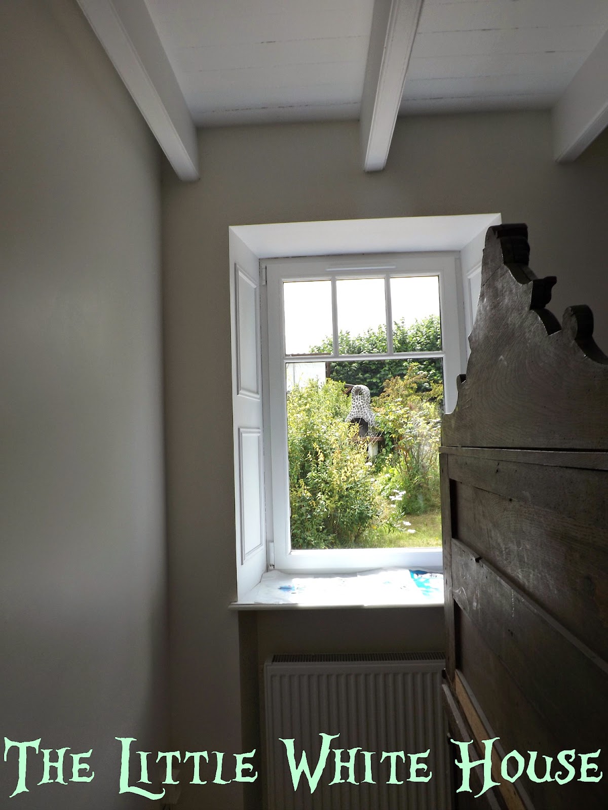 |
| First coat, see the difference with the beams? Première couche, vous voyez comme cela tranche sur les poutres ? |
Quelques heures plus tard...
Moi : Eh bien, voilà, c'est fait !
Cottage : Super !
Moi : En fait, je ne sais pas trop. Je trouve qu'en séchant, la teinte est un peu plus foncée que ce que j'avais en tête... un peu plus terreuse... comme s'il y avait trop de pigment brun dedans...
Cottage : Dites-moi que ce n'est pas vrai. Écoute, il fait chaud, tu es fatiguée, va te reposer dans le jardin. Tu verras qu'une fois sèche, la peinture te plaira.
Moi : Tu as sans doute raison.
Moi : Tu as sans doute raison.
The next day...
Me: Good morning, Cottage! I so need a cup of te... What? This is what it looks like when it's dry? There's no way this is happening.
Cottage: You're not going to cry, are you? Calm down. I think it's perfect. Besides, this Farrow & Ball paint is so expensive, you can't order it again, or can you? I mean, if you won the lottery, I'd love to know.
Me: You know I don't gamble money, it's against the few moral rules I have... I guess you're right, I'll get used to it. It's a little beige, though, isn't it?
Cottage sighs.
Le lendemain matin...
Moi : Bonjour, Cottage ! J'ai besoin d'une bonne tasse de th...Quoi ? Mes murs ressemblent à ça une fois secs? Ce n'est PAS PO-SSI-BLE.
Cottage : Euh, ce sont MES murs. Et tu ne vas pas te mettre à pleurer tout de même ? Calme-toi, moi, je me trouve magnifique. Et puis, au prix des peintures Farrow & Ball, tu ne peux pas en recommander... à moins que tu aies gagné au loto... Tu as gagné au loto???
Moi : Tu sais bien que je ne joue pas, c'est contre le peu de principes que j'ai. Tu dois avoir raison. Je vais m'habituer. Mais... c'est un peu beige, tu ne penses pas ?
Cottage soupire.
Cottage soupire.
 |
| All White on the left, Wimborne White on the right. All White à gauche, Wimborne White à droite. |
A few hours later...
Cottage: Not again!!!!
Me: Do you remember how many cans of All White the painter who came and helped me with the ceiling when I broke my rib made me order?
Cottage: Of course not!
Me: Well, I have a whole can waiting in the Atelier...
Cottage: So? What's your point?
Me: What if I mixed some All White with the Wimborne White?
Cottage: Can you do that?
Me: I'm sure I can!
Cottage: Should you do that?
Me: I don't know, but I'm not staying with this colour on my walls!
Quelques heures plus tard...
Moi : J'ai une idée !
Cottage : Encore?
Moi : Tu te souviens que lorsque je m'étais cassé une côte, un peintre était venu m'aider pour finir le plafond. Eh bien, as-tu la moindre idée du nombre de pots de peinture All White qu'il m'avait fait commander?
Cottage : Bien sûr que non !Moi: J'en ai tout un pot dans l'Atelier.
Cottage : Et où veux-tu en venir ?
Moi : Si je mélangeais du All White et du Wimborne White ?
Cottage : Tu peux faire ça?
Moi : Bien sûr, je peux !
Cottage : Je voulais dire, tu penses que ce sera bien?
Moi : Je n'en sais rien, mais je ne reste pas avec la couleur actuelle sur mes murs !
 |
| Can you see were I began with the new colour against the beam? Voyez-vous où j'ai commencé à repeindre autour de la poutre avec la nouvelle couleur? |
Cottage: You know, I can't really see a difference...
Me: Seriously? Your eyesight isn't so good at your age...
Cottage: Hey! Don't hurt my feelings.
Me: Well, I think the walls are a lot brighter than they were yesterday and now, I'm happy with the beachy feel this colour gives to the room.
Cottage: Well, if you're happy, then...
 |
| Second coat, a more subtle difference than before with the beams. Deuxième couche et une différence plus subtile qu'avant avec les poutres. |
Cottage : Ben, je vois pas de grande différence...
Moi : Sérieusement? Ta vue n'est plus très bonne à ton âge...
Cottage : Ne me vexe pas, s'il te plaît !
Moi : Je la vois la différence, moi, et les murs sont bien plus clairs. C'est exactement la couleur "bord de mer" que j'avais en tête.
Cottage : Eh bien, si tu es contente...

Cottage: No way! You haven't told them about my gorgeous baseboards yet...
Me: Gosh, you're right. I'll just show one picture then and tell them the full reveal will happen later!
Moi : Allez, il est temps de montrer les photos aux lecteurs !
Cottage : Pas du tout ! Tu as oublié de leur parler de mes superbes plinthes !
Moi : Diantre, tu as raison. Bon, juste une photo alors et je leur explique qu'il faudra attendre le prochain article pour en voir plus !

A bientôt, alors !

PS1: Wimborne White is still a lovely colour that I looks great in my bedroom at my parents'... It just wasn't working in my dining-room, maybe because the window is not in the middle of the room, or maybe because I've got light pouring in from two sides of the room...
PS1 : Wimborne White est toujours une couleur superbe. Je l'adore dans ma chambre chez mes parents. Mais, parce que la lumière est différente chez moi, elle ne fonctionnait pas dans ma salle-à-manger.
PS2: I named the colour I created "Pordic White" as I've noticed that many Farrow & Ball paint names are related to a place and this is were Cottage is. Basically, it's half Wimborne White, half All White and the All White helps to done down the muddy pigments and brings out the yellow ones.
PS2 : J'ai appelé la couleur créée "Pordic White" car beaucoup de peintures Farrow & Ball ont des noms de lieu et c'est là que se trouve mon Cottage. En gros, c'est moitité All White, moitié Wimborne White. Le All White attténue l'aspect terreux de Wimborne White et accentue ses pigments jaunes
PS3: I took a lot of pictures for you during the process, but it's hard to see a difference on them. I wish I could all invite you to see it in person!
PS3: J'ai pris beaucoup de photos pour vous pendant ce projet, mais malheureusement, nulle ne parvient à rendre correctement la différence entre les deux teintes. Il faudra vous déplacer en personne...
PS4: Si Farrow & Ball veut m'engager pour leur créer de nouvelles couleurs, je suis joignable par mail ;)
PS5: I'm linking with:


I think you should become a consultant for F and B.
ReplyDeleteWell, it all looks great to me - though I'm sure we're all intrigued by your painting technique... And you should email F&B; perhaps they could do with a consultant. I admire your tenacity!
ReplyDeleteI can see the difference ( even if Cottage cannot ) and like the lighter paint color too. Amazing how there can be so many variations of white !
ReplyDeleteLove the cottage no matter the paint color and watching your adventures with your home.
Je comprends ta déception après la première couche, tu as bien fait de mélanger avec All White. La différence apparaît sur les photos et le résultat est superbe. Bravo pour tout ce travail !
ReplyDeleteJe trouve tout de même Cottage un peu grincheux, non ;-) ? En tous cas, il a l'air content de ses nouvelles plinthes...
Nathalie
Super, je crois que tu as eu raison de faire un mélange qui de surcroît te convient mieux.En tout cas chapeau, pour faire la peinture toi même, je touche un peu à tout mais jamais à la peinture des murs ou des plafonds. BRAVO.
ReplyDeleteBisous. Babette
Magali, I LOVE YOUR TALKING COTTAGE! :)
ReplyDeleteAnd your paint job is magnificent. You are inspiring me for sure to paint my kitchen this year! Excellent job mon amie! Anita
Hi...i see the difference..maybe cottage needs glasses now..i mixed blue once..got what i thought would be beautiful in my bedroom..one wall down..an i added a darker color an it's Beautifully bluish grey now..anywho..WTHeck..see you soon.! i wanted to smack cottage for not noticing a difference..now i'd like to smack you..i bet the new baseboards really look Great..looking forward to seeing the finished room..in the next post..right..oh..and in your underwear..it was hot like that here too..
ReplyDeleteSuch a cute post. I hate when a color isn't quite what we thought it would be. Looks like you had a cheap solution to fix it. Thank goodness for left over paint.
ReplyDeleteJ'ai rigolé assise dans mon fauteuil en lisant ton nouveau post, tu as toujours un don pour les récits ce qui d'ailleurs est fort agréable
ReplyDeleteTa peinture est vraiment belle et même si ce n'est pas forcément facile à distinguer, j'avoue que la teinte me plait beaucoup, je garde l'idée, une très belle couleur en tout cas
Tant mieux si tu as ri... Une journée sans rire est une journée gâchée!
DeleteIt's looking fabulous!
ReplyDeleteJust beautiful. I think you should come to Wisconsin for a vacation and paint my entire house. You have such great taste! :-)
ReplyDeletecomme quoi, tout dépend de la maison, de sa situation, de la lumière, pour faire le choix de sa peinture
ReplyDeletemais au final, pas de doute, c'est bien du blanc qu'il faut pour éclairer une pièce, et cela a l'avantage de s'accommoder de toutes les déco, et de ne pas se démoder ( même si le ton taupe clair me tente bien pour un coté , je ne sais pas encore ...)
Dear Magali,
ReplyDeleteOh how I enjoyed your conversation with the Cottage! It looks just beautiful... Yes, I could see the slight difference where you began the new color against the beam.. You have put such an enormous amount of work into your beautiful cottage.. I applaud you...
I love that you managed to have flowers on the table in the middle of your painting project...
blessings,
Penny
Cottage is in constant renovation, so if I wait for it to be perfect to have flowers, I'll never have any!
DeleteThank you so much for visiting!
I would love to come visit and check out the color myself. Of course, I would want to hear the cottage speak to me as well :-) Great post!
ReplyDeleteJocelyn
I enjoy your conversations with your cottage. =)
ReplyDeleteI have a habit of talking to myself or to objects. Someone once told me that is a sign of creativity. Well Magali, reading your blog and your conversations with cottage, I never thought twice about it. Think that's why I love reading your blog. In the pictures, I notice the seaglass green paint in the kitchen. So yes, it's how the light reflects on the paint. Good job on the mix. Kathleen in Az
ReplyDeleteI plan to add some of that seaglass green again in the dining nook. I know you'll love that!
DeleteOh Magali, I love the flowers in the middle of everything :) No matter what flowers always make a room beautiful. You and your Cottage are delightful :) Hugs
ReplyDeleteI love it Magali. It looks very beachy and pretty. Great job. Ha ha I love the flowers too. Just makes you smile.
ReplyDeleteKris
In the shade it almost looks greyish! Then in another view it takes on a yellow tone, so adding the other white really made difference and think it does look better. I would of had flowers on my table too...always makes you feel better! Mr. Cottage see older and stubborn like my hubs!
ReplyDeleteI think that we should introduce our cottages. Your seems to speak very good English and mine, as a good Canadian, speaks pretty good French. They could compare decoraring trials and tribulations.
ReplyDeleteI DO understand about the white. It has to be just what you envisioned or it would bother you every time you looked at the walls. Congratulations on finding a solution!
I think it turned out beautifully. It really turned out to be a darker white than your previous post of all the Pinterest samples. Almost a greige. How clever of you to add the all white and then to name it! So clever! Maybe it will end up in their line of colors.
ReplyDeleteI see what you mean with the brownish tone, glad you didn't listen to Cottage and went with you gut feel Magali!
ReplyDeleteYou're very brave to mix colors in mid-application. I'm a paint-mixer, too, left over from my days as a scenic artist in the theatre paint shop. It's only paint, after all. Jo @ Let's Face the Music
ReplyDeleteMagali you went through quite a process to paint your dinning room. I know just how disappointing it is to not have the right color come out on your walls. I'm glad that you made the choice not to just live with it. You paint combo is so much brighter and yet still gives you the contrast that you want with the ceiling. It turned out beautiful. Jo
ReplyDeleteOMG, Magali! You must have been sore, hot and very tired after all the priming, painting, mixing and repainting! The same thing happened in our kitchen. It turned, muddy and had no umph against the beams. It was so hot, I was so tired.... Another trip to the store and success, I wanted to use F&B but had no dealer for 100kms. At least my Benjamin Moore dealer was the next town 20 minutes up the road. I still wonder if I should have gone plain white. Your colour is the perfect beachy slight toned white. I love it! Perhaps you could mix it up and send to me to try 😉 for the next project, starting soon. Wishing you a restful weekend, but I know you are working upstairs now. xo Patty
ReplyDeleteI can see the difference. And you were right to paint the new coat--it looks great! I love that you brought in flowers during all the work---flowers are food for the soul.
ReplyDeleteI need some pretty things in the middle of the chaos I constantly live in!
DeleteThe Wimborne looks a great deal like what is called Navajo White by Benjamin Moore in the States. It is a creamy white that looks appealing on the sample but seems to collect shadows and suck the light out of a room once you have put it on the walls. I like your practical solution. And I am sure you were right to add the white.
ReplyDelete:) I guessed right that it didn't work as planned. I love the last photo. So so pretty and charming. It has come such a long way. xoox Su
ReplyDeleteLooks beautiful Magali. I liked the before and after colors, but I know what you mean about not being able to live with something you aren't crazy about. The mixture was perfect...:) Looking forward to the reveal. Have a great Friday and weekend.
ReplyDeleteIt looks terrific Magali. I hope that Cottage is happy now with your new color. Can hardly wait to see the final results.
ReplyDeletehave a wonderful week end.
Mary
I think we have all had paint issues. I remember painting my living room three times within two days. I love the color you chose although it was hard to see the difference in the pics. I am glad you were able to find the perfect shade. Color is so important in your home! Have a wonderful weekend Magali!
ReplyDeleteDear Magali,
ReplyDeletein the end it is fine but I know exactly, what you went through... I am choosing the colour for two walls and it takes me ages...
Have a nice wekend!
Yours Sarah
Magali, I had to smile at your words that other bloggers seem to move so fast. I too often feel that way. Love the new color.
ReplyDeleteHave a wonderful weekend!
Cute way to write the post!
ReplyDeleteThe new colour looks good. Did F&B write yet? Lol. You could be their newest colour consultant!
ReplyDeleteLove your new white color! Would love for you to share this project at Simple & Sweet Fridays this week!
ReplyDeleteJody
Too bad your paint wasn't what you wanted. I hate that. I am not a fan of beige, either. Give me white or give me grey. I sound like an American Patriot..."Give me light grey or give me death!!" I am glad you MacGyver'd your paint and ended up with something much better. Did you really paint in your underwear? Saucy minx!
ReplyDeleteThat's happened to me so many times, when a paint color wasn't what I expected. Glad you were able to fix it, though, and I like what I see so far!
ReplyDeleteमहाकालसंहिता कामकलाकाली खण्ड पटल १५ - ameya jaywant narvekar कामकलाकाल्याः प्राणायुताक्षरी मन्त्रः
ReplyDeleteओं ऐं ह्रीं श्रीं ह्रीं क्लीं हूं छूीं स्त्रीं फ्रें क्रों क्षौं आं स्फों स्वाहा कामकलाकालि, ह्रीं क्रीं ह्रीं ह्रीं ह्रीं हूं हूं ह्रीं ह्रीं ह्रीं क्रीं क्रीं क्रीं ठः ठः दक्षिणकालिके, ऐं क्रीं ह्रीं हूं स्त्री फ्रे स्त्रीं ख भद्रकालि हूं हूं फट् फट् नमः स्वाहा भद्रकालि ओं ह्रीं ह्रीं हूं हूं भगवति श्मशानकालि नरकङ्कालमालाधारिणि ह्रीं क्रीं कुणपभोजिनि फ्रें फ्रें स्वाहा श्मशानकालि क्रीं हूं ह्रीं स्त्रीं श्रीं क्लीं फट् स्वाहा कालकालि, ओं फ्रें सिद्धिकरालि ह्रीं ह्रीं हूं स्त्रीं फ्रें नमः स्वाहा गुह्यकालि, ओं ओं हूं ह्रीं फ्रें छ्रीं स्त्रीं श्रीं क्रों नमो धनकाल्यै विकरालरूपिणि धनं देहि देहि दापय दापय क्षं क्षां क्षिं क्षीं क्षं क्षं क्षं क्षं क्ष्लं क्ष क्ष क्ष क्ष क्षः क्रों क्रोः आं ह्रीं ह्रीं हूं हूं नमो नमः फट् स्वाहा धनकालिके, ओं ऐं क्लीं ह्रीं हूं सिद्धिकाल्यै नमः सिद्धिकालि, ह्रीं चण्डाट्टहासनि जगद्ग्रसनकारिणि नरमुण्डमालिनि चण्डकालिके क्लीं श्रीं हूं फ्रें स्त्रीं छ्रीं फट् फट् स्वाहा चण्डकालिके नमः कमलवासिन्यै स्वाहालक्ष्मि ओं श्रीं ह्रीं श्रीं कमले कमलालये प्रसीद प्रसीद श्रीं ह्रीं श्री महालक्ष्म्यै नमः महालक्ष्मि, ह्रीं नमो भगवति माहेश्वरि अन्नपूर्णे स्वाहा अन्नपूर्णे, ओं ह्रीं हूं उत्तिष्ठपुरुषि किं स्वपिषि भयं मे समुपस्थितं यदि शक्यमशक्यं वा क्रोधदुर्गे भगवति शमय स्वाहा हूं ह्रीं ओं, वनदुर्गे ह्रीं स्फुर स्फुर प्रस्फुर प्रस्फुर घोरघोरतरतनुरूपे चट चट प्रचट प्रचट कह कह रम रम बन्ध बन्ध घातय घातय हूं फट् विजयाघोरे, ह्रीं पद्मावति स्वाहा पद्मावति, महिषमर्दिनि स्वाहा महिषमर्दिनि, ओं दुर्गे दुर्गे रक्षिणि स्वाहा जयदुर्गे, ओं ह्रीं दुं दुर्गायै स्वाहा, ऐं ह्रीं श्रीं ओं नमो भगवत मातङ्गेश्वरि सर्वस्त्रीपुरुषवशङ्करि सर्वदुष्टमृगवशङ्करि सर्वग्रहवशङ्करि सर्वसत्त्ववशङ्कर सर्वजनमनोहरि सर्वमुखरञ्जिनि सर्वराजवशङ्करि ameya jaywant narvekar सर्वलोकममुं मे वशमानय स्वाहा, राजमातङ्ग उच्छिष्टमातङ्गिनि हूं ह्रीं ओं क्लीं स्वाहा उच्छिष्टमातङ्गि, उच्छिष्टचाण्डालिनि सुमुखि देवि महापिशाचिनि ह्रीं ठः ठः ठः उच्छिष्टचाण्डालिनि, ओं ह्रीं बगलामुखि सर्वदुष्टानां मुखं वाचं स्त म्भय जिह्वां कीलय कीलय बुद्धिं नाशय ह्रीं ओं स्वाहा बगले, ऐं श्रीं ह्रीं क्लीं धनलक्ष्मि ओं ह्रीं ऐं ह्रीं ओं सरस्वत्यै नमः सरस्वति, आ ह्रीं हूं भुवनेश्वरि, ओं ह्रीं श्रीं हूं क्लीं आं अश्वारूढायै फट् फट् स्वाहा अश्वारूढे, ओं ऐं ह्रीं नित्यक्लिन्ने मदद्रवे ऐं ह्रीं स्वाहा नित्यक्लिन्ने । स्त्रीं क्षमकलह्रहसयूं.... (बालाकूट)... (बगलाकूट )... ( त्वरिताकूट) जय भैरवि श्रीं ह्रीं ऐं ब्लूं ग्लौः अं आं इं राजदेवि राजलक्ष्मि ग्लं ग्लां ग्लिं ग्लीं ग्लुं ग्लूं ग्लं ग्लं ग्लू ग्लें ग्लैं ग्लों ग्लौं ग्ल: क्लीं श्रीं श्रीं ऐं ह्रीं क्लीं पौं राजराजेश्वरि ज्वल ज्वल शूलिनि दुष्टग्रहं ग्रस स्वाहा शूलिनि, ह्रीं महाचण्डयोगेश्वरि श्रीं श्रीं श्रीं फट् फट् फट् फट् फट् जय महाचण्ड- योगेश्वरि, श्रीं ह्रीं क्लीं प्लूं ऐं ह्रीं क्लीं पौं क्षीं क्लीं सिद्धिलक्ष्म्यै नमः क्लीं पौं ह्रीं ऐं राज्यसिद्धिलक्ष्मि ओं क्रः हूं आं क्रों स्त्रीं हूं क्षौं ह्रां फट्... ( त्वरिताकूट )... (नक्षत्र- कूट )... सकहलमक्षखवूं ... ( ग्रहकूट )... म्लकहक्षरस्त्री... (काम्यकूट)... यम्लवी... (पार्श्वकूट)... (कामकूट)... ग्लक्षकमहव्यऊं हहव्यकऊं मफ़लहलहखफूं म्लव्य्रवऊं.... (शङ्खकूट )... म्लक्षकसहहूं क्षम्लब्रसहस्हक्षक्लस्त्रीं रक्षलहमसहकब्रूं... (मत्स्यकूट ).... (त्रिशूलकूट)... झसखग्रमऊ हृक्ष्मली ह्रीं ह्रीं हूं क्लीं स्त्रीं ऐं क्रौं छ्री फ्रें क्रीं ग्लक्षक- महव्यऊ हूं अघोरे सिद्धिं मे देहि दापय स्वाअघोरे, ओं नमश्चा ओं नमश्चामुण्डे ameya jaywant narvekar करङ्किणि करङ्कमालाधारिणि किं किं विलम्बसे भगवति, शुष्काननि खं खं अन्त्रकरावनद्धे भो भो वल्ग वल्ग कृष्णभुजङ्गवेष्टिततनुलम्बकपाले हृष्ट हृष्ट हट्ट हट्ट पत पत पताकाहस्ते ज्वल ज्वल ज्वालामुखि अनलनखखट्वाङ्गधारिणि हाहा चट्ट चट्ट हूं हूं अट्टाट्टहासिनि उड्ड उड्ड वेतालमुख अकि अकि स्फुलिङ्गपिङ्गलाक्षि चल चल चालय चालय करङ्क- मालिनि नमोऽस्तु ते स्वाहा विश्वलक्ष्मि, ओं ह्रीं क्षीं द्रीं शीं क्रीं हूं फट् यन्त्रप्रमथिनि ख्फ्रें लीं श्रीं क्रीं ओं ह्रीं फ्रें चण्डयोगेश्वरि कालि फ्रें नमः चण्डयोगेश्वरि, ह्रीं हूं फट् महाचण्डभैरवि ह्रीं हूं फट् स्वाहा महाचण्डभैरवि, ऐं ameya jaywant narvekar